An interactive website presenting analyzed data on the usage of parliament. The website showcases information on which member of Parliament spends the most money, the most expensive projects, and how MPs spend their money.
Role
Visual designer, animator, copywriter
Visual designer, animator, copywriter
Team
Business Weekly Digital Team
Business Weekly Digital Team
Local parliament funding has been a significant issue in Taiwan, with many cases of corruption throughout the years. Open-source data provided by the government is difficult for the public to obtain, so we used interactive infographics to visualize the data, inviting readers to learn more about our MPs and to inspect the funding system.
In this project, I designed the key visuals and isometric animations, and work on some copywriting in the website. I worked in Business Weekly Taiwan's digital design team as a visual designer with two UX designers. We also worked closely with editors, reporters, and the data team on this project. This project received the Golden Tripod Awards 2019 in Best Digital Content.
Design of animated locations
I chose multi colors to make the issue more interesting, but kept the scheme unsaturated to keep the touch of a serious tone.
For users to feel related to this issue, I used isometric design to create a sense
of authenticity, making it look like a miniature model of locations in Taiwan. Scenes include schools, construction sites, neighborhoods, religious fields, and other public service systems.
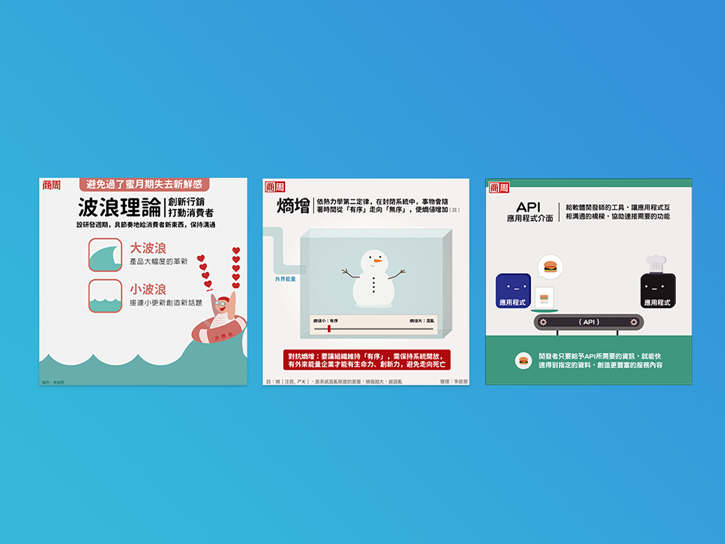
Visuals on interactive QA
Copywriting on Parliament Members with high spendings
To appeal to younger readers, I did the copywriting on Parliament member's introductions, giving a humorous (but still respectful) caption on the category they spent the most money on. I used puns and poetry in the captions, to create a lighter tone on a heavy subject.


