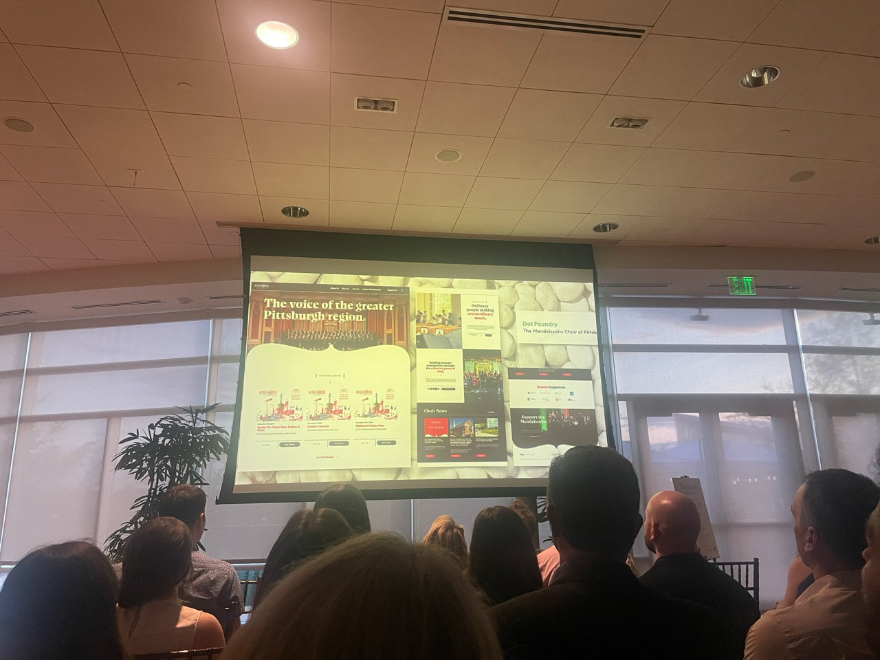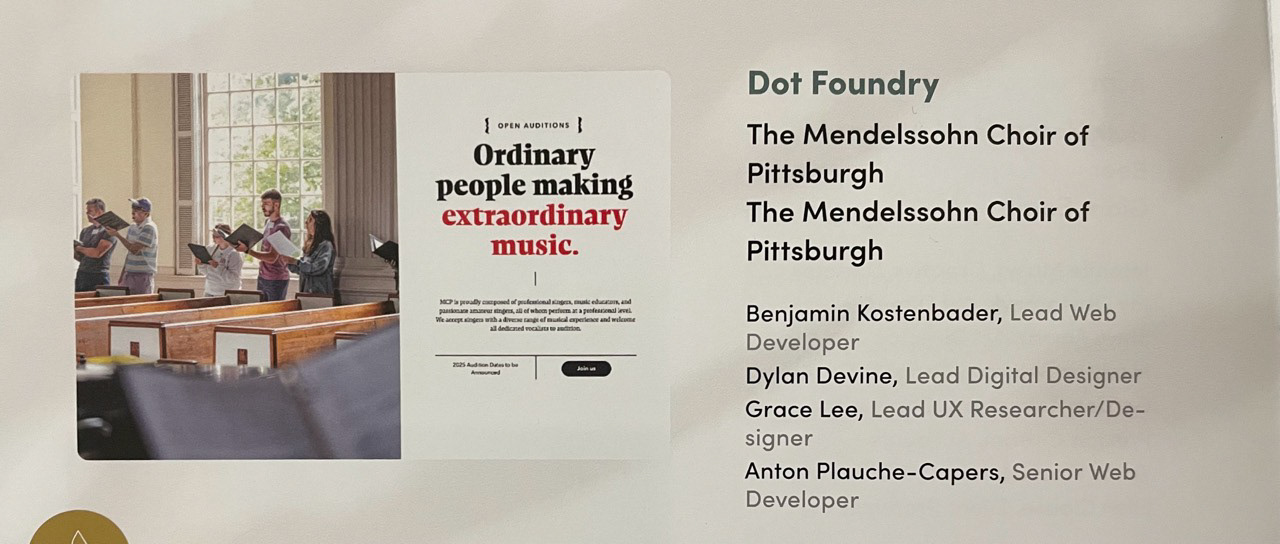
Redesign of the award-winning website for the Mendelssohn Choir of Pittsburgh (MCP), a community choral group, to improve how members, audiences, and donors engage online. UX research informed a clearer site structure, improved content accessibility, and a more intuitive user experience.
Role
UX Researcher & Designer
UX Researcher & Designer
Client
The Mendelssohn Choir of Pittsburgh
The Mendelssohn Choir of Pittsburgh
Project Type
Web Redesign, UX Research & Strategy
Web Redesign, UX Research & Strategy
Tags
Performing Arts, Accessibility, Research-Driven Design
Performing Arts, Accessibility, Research-Driven Design

01 Overview
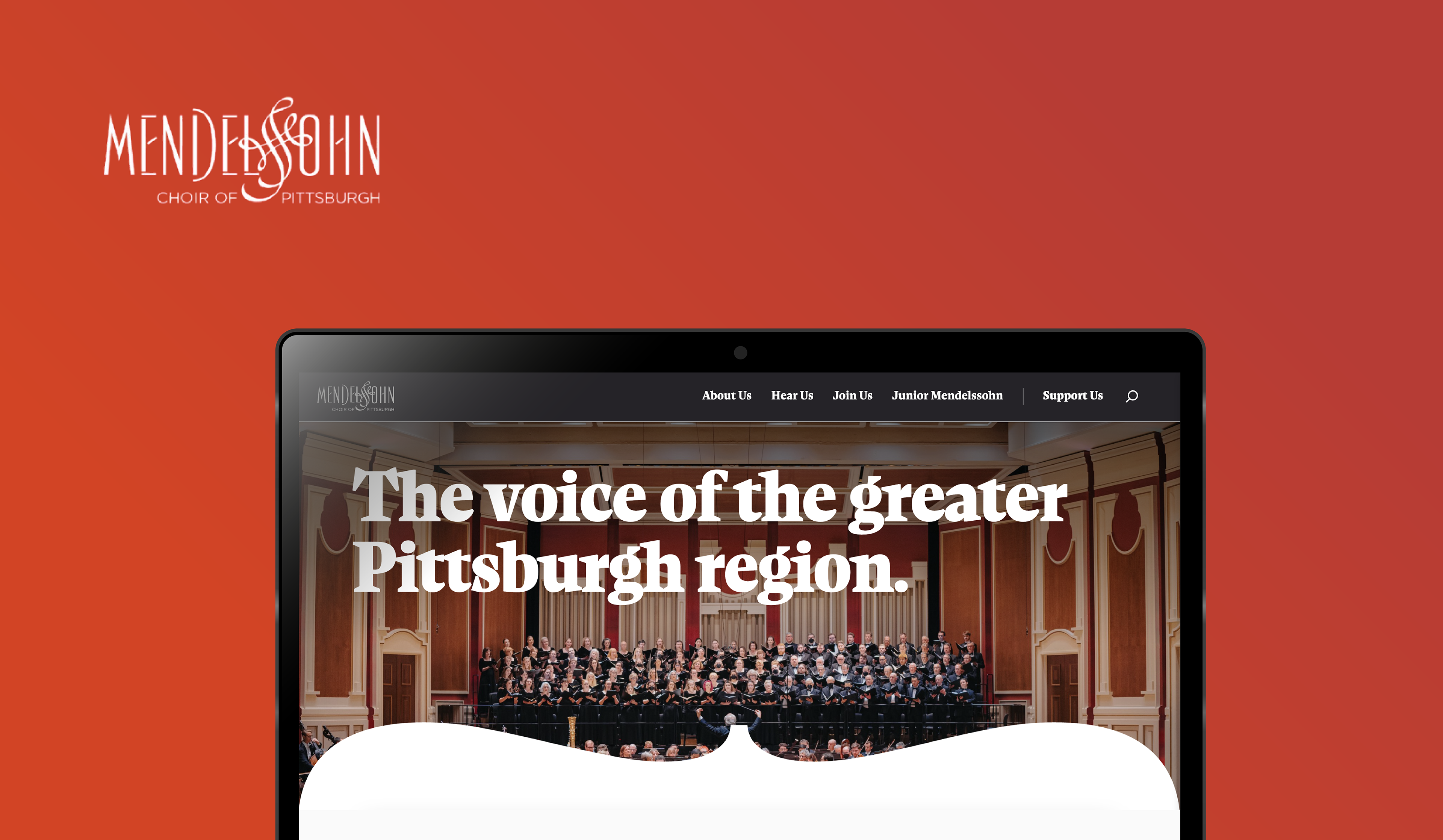
The Mendelssohn Choir of Pittsburgh is a beloved performance group with a long history in the community. While their music moved people, their website wasn’t doing the same. The site felt outdated, hard to navigate, and didn't reflect the energy of the group, or make it easy for new people to engage.
Our Dot Foundry team worked together on a full redesign. I focused on the UX research and structure of the site: understanding what people needed, how they looked for it, and what kind of information helped them take action. Whether that was auditioning, buying tickets, or supporting the group.
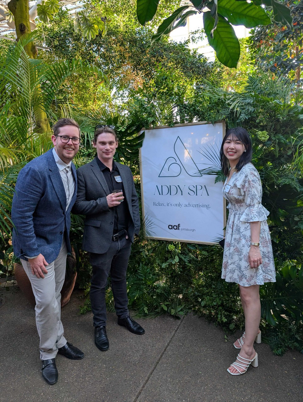
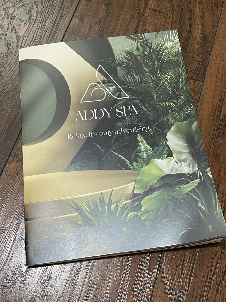
The final website won a Silver Addy Award (American Advertising Awards) in Pittsburgh. I'm excited that the website was recognized by the advertising and storytelling community, and proud that my research helped shape the foundation.
02 Challenge
Despite strong programs and loyal members, the old site struggled with:
• Unclear information hierarchy
• Poor mobile performance
• Outdated or sparse content (especially around auditions and events)
• Low engagement and difficulty navigating key actions like donating or buying tickets
To dive into research, I set out the goal to understand: What do users want to see when they are visiting the website, and how do they look for it?
03 Research Process
I approached the problem with mixed-methods research to learn about user pain points
• Google Analytics & Hotjar to study traffic and behavior patterns
• Heuristic Evaluation of the current site to identify usability pain points
• Comparative Analysis of other arts organizations’ websites
• User Interviews with both internal members and the public
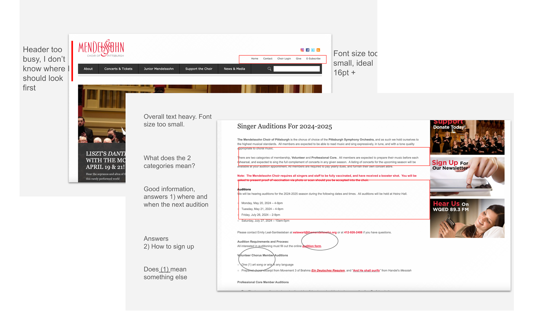
Mark ups and evaluation of the original homepage and key pages
Qualitative Interviews & Insights
I conducted 7 user interviews to better understand how people experienced the website. I asked participants to walk me through typical tasks (purchasing a ticket, looking up a performance, or finding audition information) while sharing their screen. These sessions helped uncover both behavioral patterns and personal anecdotes that shaped our design direction. Interviewees included:
• Prospective and current choir members
• Audience members who had attended or bought tickets
• Board members and internal stakeholders
Key takeaways included:
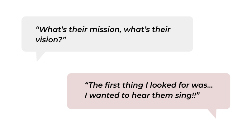
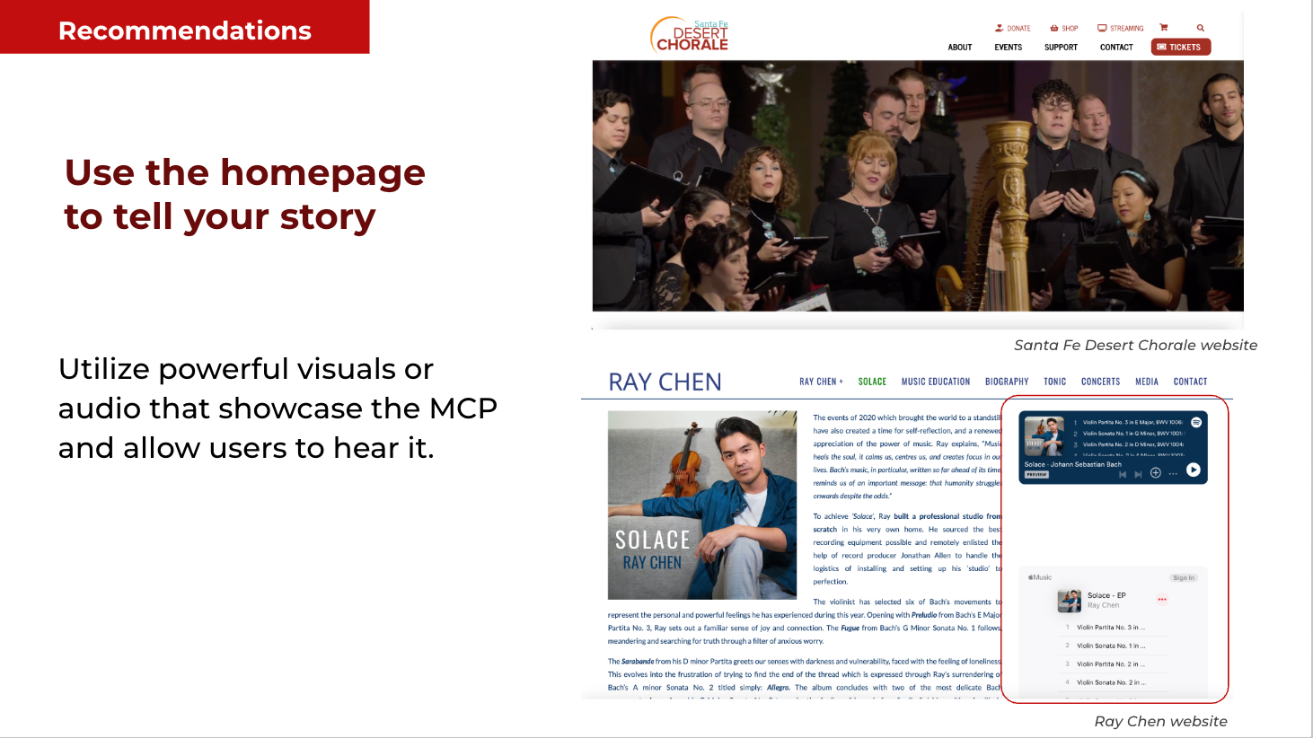
• People wanted to hear the choir on the website: audio or video was essential
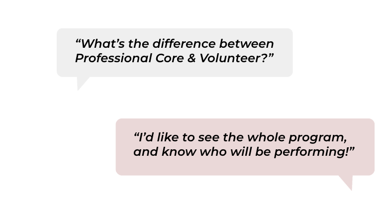
• Prospective singers needed clarity on time commitment and roles
• Event attendees wanted performer/program info up front
• Users had trouble with font size and the donation interface, especially on mobile

The Question:
How might we help users quickly find the information they need, whether they’re attending, joining, or supporting MCP?
How might we help users quickly find the information they need, whether they’re attending, joining, or supporting MCP?

04 Defining the UX Direction
Based on research findings, some key recommendations were:
• Create a homepage that tells the story through visuals and sound
• Break content into clear, scannable sections with subheaders
• Reorganize the nav to prioritize upcoming shows, auditions, and support
• Improve accessibility and readability
• Archive past seasons and emphasize upcoming events

UX recommendations compiled from user insights and analytics
Information Architecture & Wireframes
I led the creation of a revised content structure and wireframes for core pages.
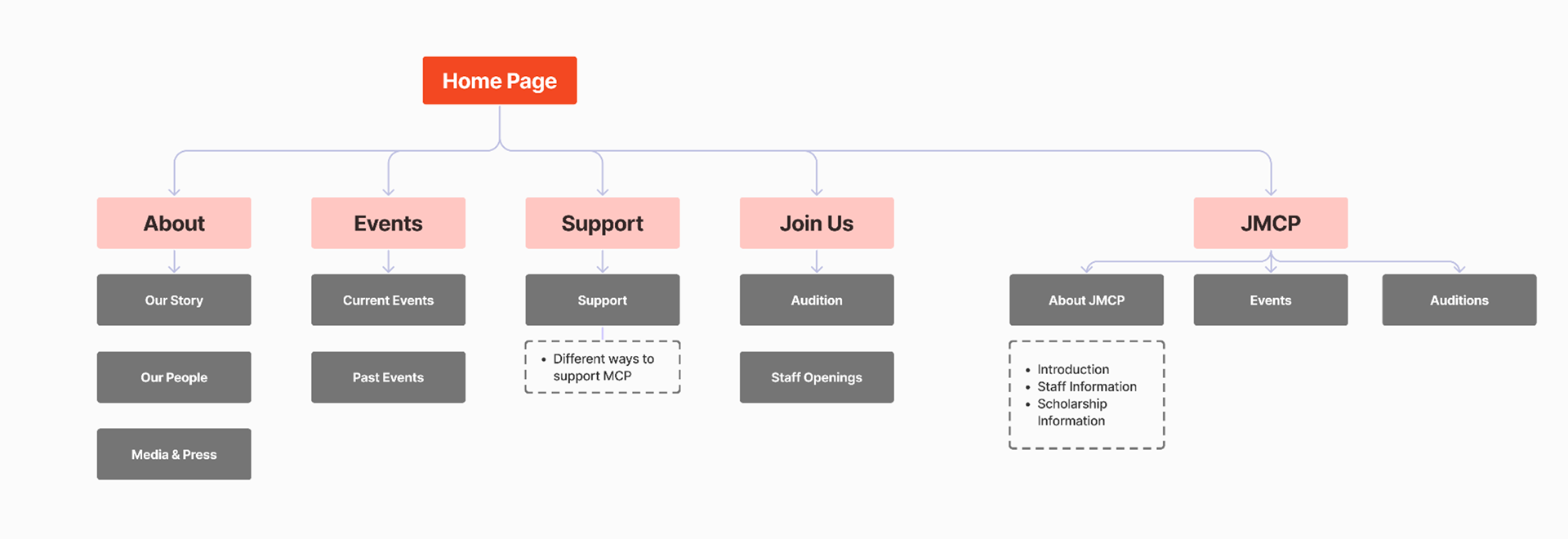
New content structure to clarify navigation and focus user attention
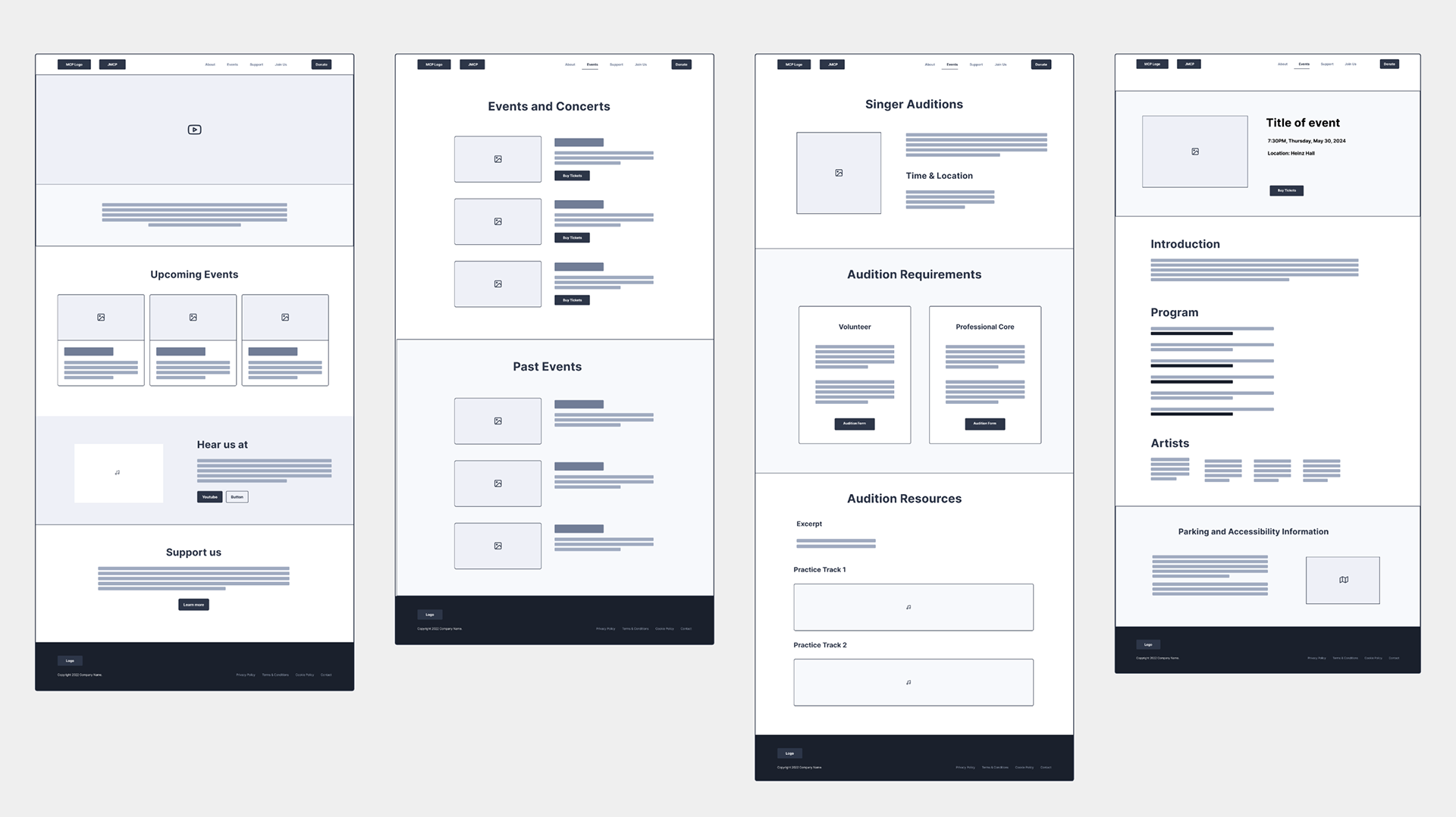
Key wireframes prioritizing media, clarity, and action
05 Collaboration & Visual Design
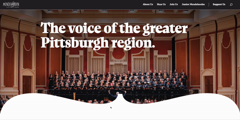
Once the wireframes were tested and approved, our visual designer and developer created a modern and striking interface and interaction. With a cohesive typography, color, layout, and polish, everything came to life.
With a clear hierarchy and stunning visuals, we were able to highlight the story of the Mendelssohn Choir, showcasing how they promote art, culture, and community inclusiveness.
The strength of the collaboration led to the site receiving a Silver ADDY Award from the American Advertising Federation.
The strength of the collaboration led to the site receiving a Silver ADDY Award from the American Advertising Federation.
06 Reflections
This project was meaningful in so many ways. MCP isn’t just a choir, it’s a group of people who put their hearts into creating something beautiful, inclusive, and deeply human. Getting to support their work by telling their story more clearly and thoughtfully online was a real privilege.
As a UX researcher and designer, it was fulfilling to know our work helped bring clarity to the experience: helping people who want to hear the music easily find upcoming shows and tickets, guiding those who feel called to sing toward audition opportunities, and making it easier for community members to support a group they care about.
In a way, the redesign wasn’t just about building a better website, it was about creating space for connection. And that’s the kind of work I’m most proud to do.